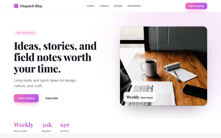
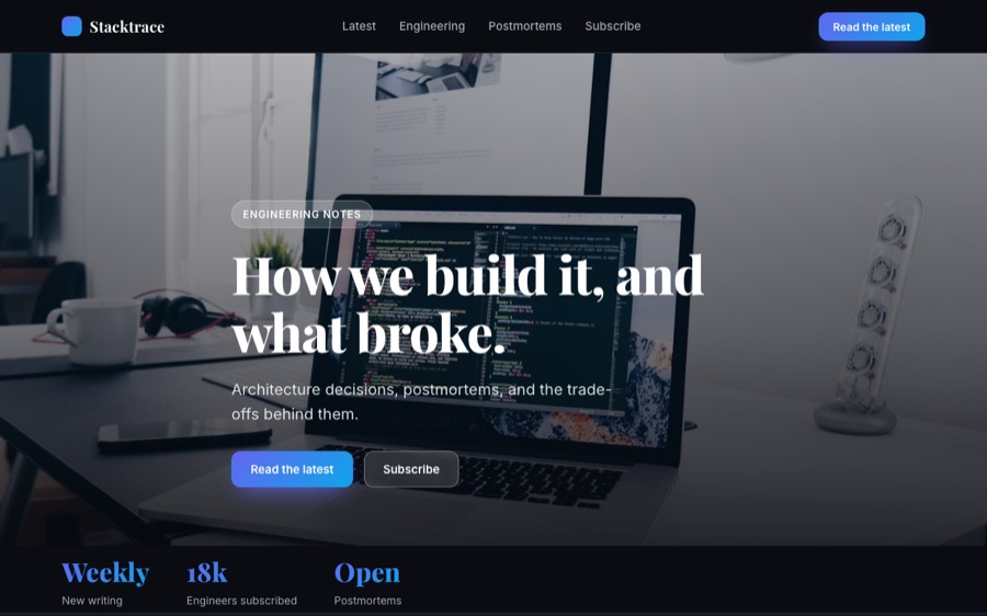
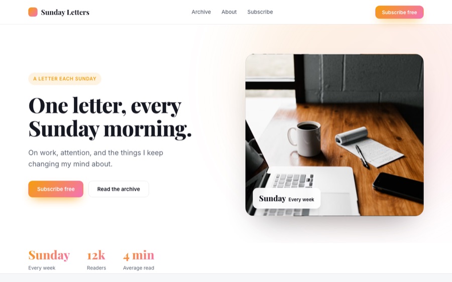
Readable by default
Line length, leading and contrast tuned for long-form rather than for a screenshot.

An editorial journal for food, farming and slow living.
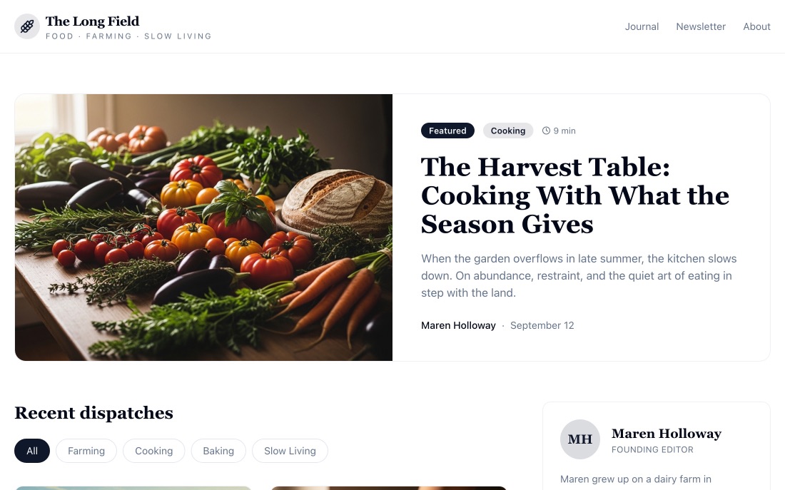
The Long Field is a publication, so the design gets out of the way: generous measure, real typographic hierarchy, and article pages that are comfortable to read for more than thirty seconds.
Dispatches are filterable by theme, and every post has a proper detail page rather than an expanding accordion — which matters if you ever want the writing to be findable.
Audience-first publishing. The site builds a readership that can later be monetised through a newsletter, sponsorship or membership — so the newsletter capture is part of the layout, not bolted on.
Line length, leading and contrast tuned for long-form rather than for a screenshot.
Themes let a reader follow one thread through the back catalogue.
Capture sits where a reader has just finished something, not in a popup.