Menu that reads like a menu
Prices and descriptions laid out for scanning, not scrolling.

A specialty-coffee shop site that went from one sentence to live.
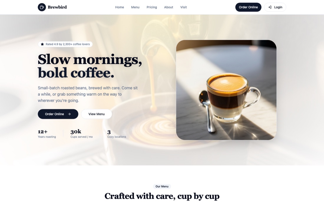
BrewHaven is a neighbourhood coffee brand that needs its site to feel as considered as the roast — warm, tactile, and quick to scan on a phone while someone is deciding where to get their morning cup.
The whole page was generated from a single prompt: menu, story, hours and location. No template wrangling, no theme to fight. The result is a real static site you own, fast enough to load on café wifi.
Independent retail. The site is a storefront for foot traffic — its job is to communicate quality, surface the menu, and get someone through the door, not to process payments.
Prices and descriptions laid out for scanning, not scrolling.
Colour and type chosen to make the product look good, which is most of the job.
The two things visitors actually came for, above the fold.